


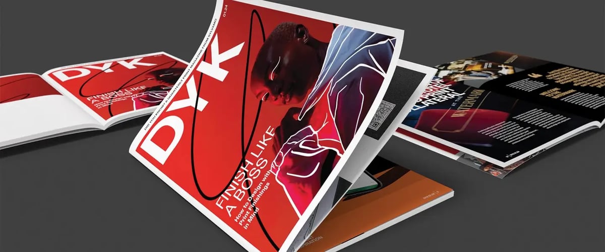
Our Did You Know? has long been a valuable print resource for tips, techniques and inspiration for designers and printers on how to create next-level print materials for a wide range of applications. But we wanted to shake things up a bit in 2024, so we expanded the format of the Did You Know? into a quarterly magazine that offers a more in-depth look at the discussions and conversations that are being had by today’s print industry professionals.
Each issue of the DYK Magazine will feature a specific theme, and, for the first issue, we focused on finishings — how to design for specific finishing techniques, ideas for new and innovative finishings and troubleshooting issues with incorporating finishings into your design. Here’s a quick look at some of what this issue has to offer.
A feature on finishings
We thought starting the DYK Magazine with a focus on finishings was appropriate because it’s so easy for designers to fail to consider finishing techniques until the end of the design process, when it may be too late to incorporate them. However, accounting for the kinds of finishings you want to incorporate at the beginning of the design phase actually lends itself to a more efficient and fruitful design and print process.
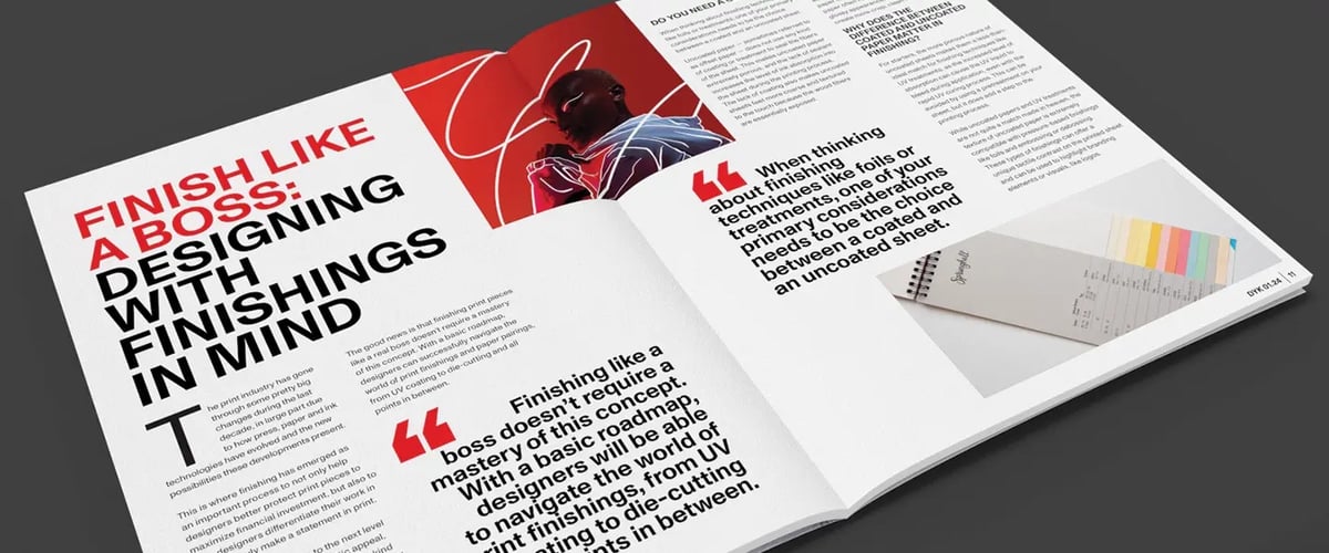
For example, our feature, “Finishing Like a Boss: Designing with Finishings in Mind,” discusses how your choice of uncoated vs. coated paper plays an important role in the kind of finishings you can incorporate into your design concept.
“While uncoated papers and UV treatments are not quite a match made in heaven, the texture of uncoated paper is extremely compatible with pressure-based finishings like foils and embossing or debossing. Similarly, the glossy feel and appearance of coated sheets makes this kind of paper less ideal for embossing or debossing as the finer textural details and contrast won’t be as evident.”
Favorite finishing techniques from Pam Howard of Firebrick Design
Part of what the DYK Magazine aspires to be is a regular source of inspiration for designers, as well as a platform for thought leadership and idea exchange from some of the industry’s top design professionals. We interviewed Pam Howard of Firebrick Design about where she finds inspiration and how she approaches finishing techniques in her own work. Here’s a brief snippet of this interview.
DYK: Who or what do you look to for inspiration?
Pam Howard: I look everywhere and at everything. Of course, other designers are inspiring. But so are grocery stores, nature, social media, museums, books, movies, playgrounds, junk stores, kids’ toys. Honestly, designers are hoarders. We hoard memories and images. For one recent project, I used elements from a vintage postcard I bought at a barn sale when I was 12. I’m currently working on a project that has me delving into tunnel book forms from the Belle Epoque.
Your print work often involves fun finishings and specialty techniques. What are some of your favorite finishing techniques and why?
I don’t think I have a favorite technique — each project demands a certain look and feel. A technique may be perfect for one project, but completely wrong for another. Traditional letterpress, engraving, foil, blind emboss, Riso, die-cut… I’m shameless — I’ll incorporate aspects of any of these for my work!
Mailbag: The importance of paper stock in finishing
With the DYK Mailbag, we address a variety of reader-submitted questions on all things design and print — you can send us your question here and we’ll feature it in an upcoming issue.
To give you an idea of what the DYK Mailbag looks like, here’s one question we addressed in the inaugural issue from a small Etsy seller located just outside Spokane, Washington.
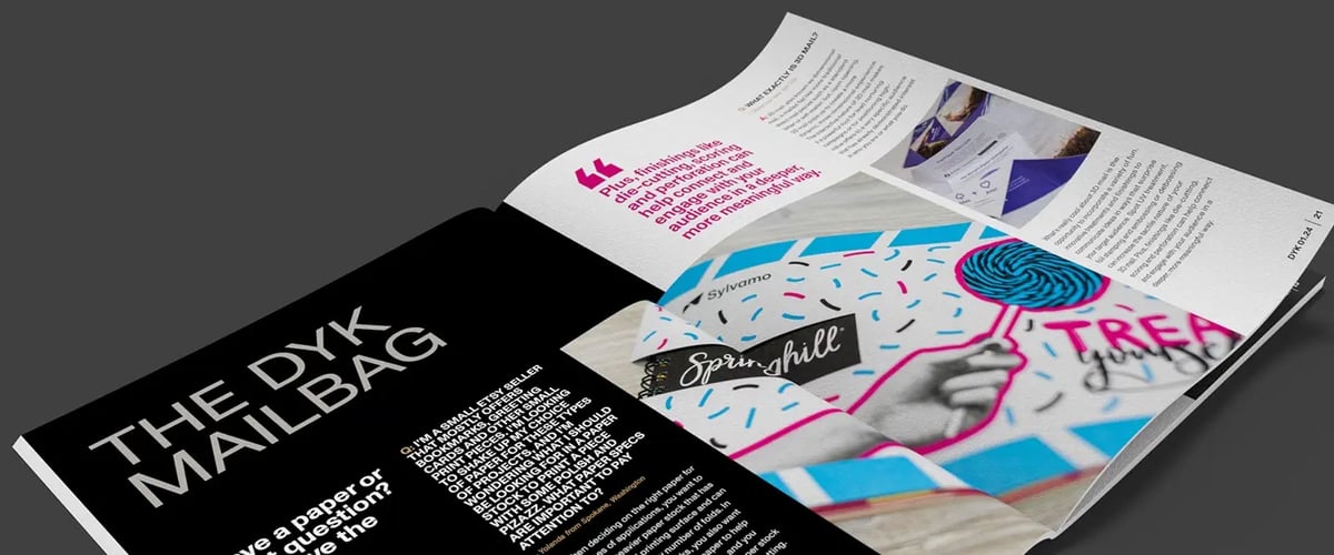
Question: I’m a small Esty seller that mostly offers bookmarks, greeting cards or other small print pieces. I’m looking to shake up my choice of paper for these types of projects, and I’m wondering what I should be looking for in a paper stock to print a piece with some polish and pizazz. What paper specs are important to pay attention to?
— Yolanda from Spokane, Washington
Answer: When deciding on the right paper for these types of applications, you want to prioritize a heavier paper stock that has a smooth, level printing surface and can accommodate any number of folds. In the case of bookmarks, you also want to choose an acid-free paper to help extend the life of the piece, and you also want to use a heartier paper stock that is ideal for scoring or die-cutting.
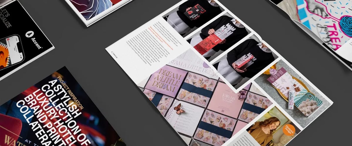
All of this is just the beginning of our exploration on print finishings in this quarter’s DYK Magazine. This issue also includes a Spotify playlist to jumpstart your design work, a project spotlight on stunning sales and marketing collateral for the travel and hospitality industry and so much more.
Subscribe to the DYK Magazine to ensure a complimentary copy of each new issue is mailed directly to you.
