


Though it sounds like they could mean something similar, the measurements of brightness versus whiteness in premium paper stock are actually quite distinct and very different.
The trouble is these terms are often confused or in some cases inaccurately combined. Not only can this make it difficult to choose the right premium paper for your application, such misinformation can negatively impact the print quality of your project.
Because untangling the differences between brightness and whiteness is so important, let’s briefly break down what each measurement actually means, and why you should take the differences between brightness and whiteness into account when it’s time to print your next project.
 What is paper brightness?
Paper brightness is a narrow measurement of the amount of reflectance of a specific wavelength of blue light. The industry standard of using blue light to measure brightness of paper comes from the fact that the human eye perceives a bluish tint as whiter than the neutral white of the color spectrum.
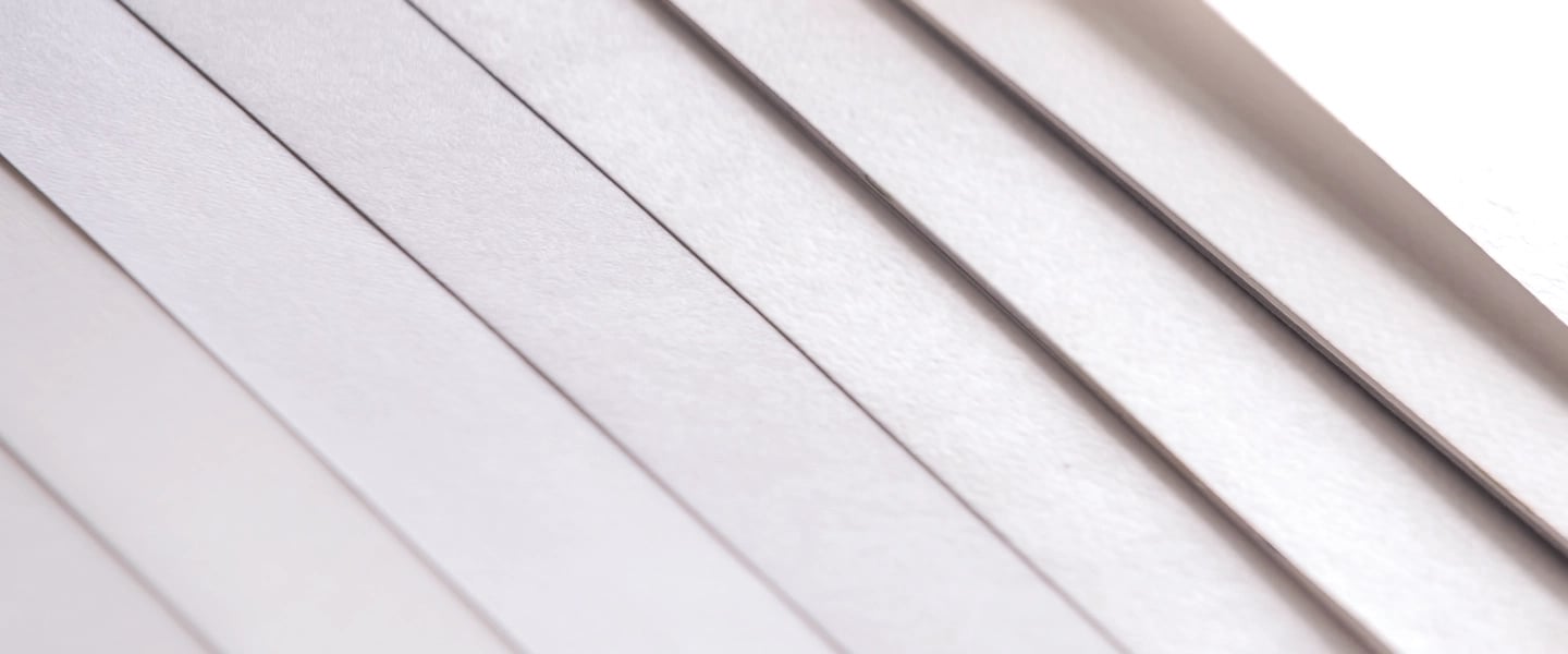
Brightness is measured on a scale of 0 to 100 – the higher the number, the brighter the paper, and brighter papers are considered premium papers. For example, a 97 brightness paper reflects more light of a particular wavelength than a 92 brightness paper. Brightness does not measure other wavelengths of light, which means two papers of identical brightness can be different colors or shades.
This is important because different shades can very much impact the quality of colors or graphics and how they appear on the printed sheet. Generally speaking, brighter white papers display bright colors more vibrantly, while light colors like white skin tones can appear washed out on the brightest white papers. (For light skin tones, a warm white paper is best.)
What is paper whiteness?
Whereas brightness is a measurement of the reflectance of a particular blue wavelength, paper whiteness measures the reflectance of all wavelengths (or colors), which more closely aligns it with how the human eye perceives the paper. A measurement of a paper’s whiteness is a good indicator of the shade of any given sheet because it measures the reflectance of more than just the blue wavelength.
During paper production, a mixture of dyes is used to produce a color balance that appears white. A paper’s whiteness will be more warm white if the dye uses more reds, while the sheet will be more cool white if the dye contains more blues. A more bluish tint to the sheet will help whites look brightest, and a more neutral white will help other colors appear more vibrant.
What’s important about determining a paper’s whiteness is the location. Because outdoor light consists of UV light, papers treated with optical brightening agents (OBAs) — which are chemical agents that absorb UV light and increase blue reflectance as a result — can appear brighter outdoors compared to indoors. On a similar note, a white sheet not treated with OBAs may appear whiter indoors but seem less vibrant outside.
What’s the right paper brightness and whiteness for my print project?
When choosing a paper with the ideal brightness and whiteness for sharp images, vibrant colors or crisp text, it’s actually best to let the application or project dictate the brightness or whiteness of the paper you’re going to use.
For example, print that uses single-color pages or color photography is better suited for paper with high brightness, while print such as stationary or books doesn’t require the high brightness found in premium paper.
When thinking about the ideal whiteness for specific print projects, books with black and white text are a good match for paper with a more neutral whiteness, as the lower contrast is less fatiguing on the eyes.
With a better understanding of paper brightness and whiteness in your toolbox, choosing the right kind of paper to create high quality print should be a much easier proposition.
Ready to use your newfound paper knowledge? Both Accent Opaque Cover and Accent Opaque Text are 97 brightness to help you unlock next-level quality print.
