How These Finishings Can Help You Design More Engaging Direct Mail

They say a picture is worth 1,000 words, and that couldn’t be more true when it comes to designing — and receiving — direct mail. The human brain processes visuals 60,000 times faster than text, which means the visual impact of each piece of direct mail can’t be understated.
While the number of emails sent and received in 2023 exceeded 347 billion, the average response rate of direct mail marketing is almost 3% higher than that of email. And what’s more, around 42% of customers visited a brand’s website as a result of receiving direct mail.
But how can you elevate your print projects and create a more engaging tactile and sensory experience? The key is the finishings. Not only do finishings increase the visual appeal, but the inclusion of finishing techniques can better engage your target audience and help ensure your direct mail piece has more staying power compared to a mailer without finishings.
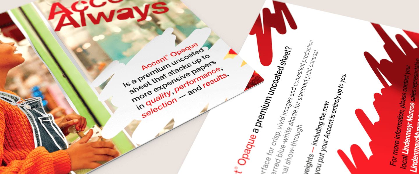
Here, we’ll look at how some unique finishings can help you design more engaging direct mail, and how Accent® Opaque premium paper can help you make the most of these finishing techniques.
UV coating
If you’re looking for a unique, glossy finish, ultraviolet (UV) coating is a great option. Not only does it create a polished look that can enhance the appearance of your marketing materials, it also protects them from the wear and tear they may incur during the mailing process.
With UV coating, a coating machine applies a clear compound to printed paper, and then dries it instantly with UV light, leaving behind a coating fit to your specifications — be in a subtle matte or high-gloss finish. This coating can be applied to the entire piece, or you can opt for Spot UV, where only certain areas of the printed piece are coated.
This can make logos and images stand out with both a contrasting, raised appearance, and also an added tactile element. For example, this marketing collateral application sample for the travel and tourism industry used a UV coating on the outer folder to create a more exclusive, high-end feel.
Embossing and debossing
Embossing is a creative way to add depth and a raised effect to your direct mail marketing pieces, while debossing has the opposite effect — the image is pressed down instead of up. Both applications focus on one particular area, and can be used on most types of paper.
However, the level of detail that you can emboss is largely dependent on the thickness of that paper or cardstock. The thinner the paper, the more detail you can achieve.
The beauty of this technique really lies in the versatility and perceived value. You can not only emboss or deboss certain words and phrases with ink, but you can also emboss or deboss metallic foil into your marketing mail, adding an extra dimension and emphasis to specific areas of your mailer for a desired effect.
Foil stamping
One of the easiest ways to capture attention on a direct mail piece is to incorporate foil stamping, which involves using a sculpted metal stamp or die to apply metallic foil to paper with heat. In a study from the Foil and Specialty Effects Association, they found that pieces embellished with foil were identified 45% quicker by shoppers than those without foil, and those embellished products held customers' attention 18% longer compared to products without embellishing.
You can get creative with metallic colors, pearl or pigment foils and they even have holographic foils to create a reflective rainbow effect. Foil stamping works best with thicker paper void of textures so that foil has a smooth surface for application — for example, The Heavyweights is an ideal heavyweight paper stock for foil stamping.
One thing to pay close attention to with foil stamping is your choice of font, as fine lines run the risk of being lost in the process of stamping. To avoid this, it’s best practice to foil the largest words that are the easiest to read and make sure there’s enough space between each line.
Die-cutting
To stand out from your mailbox competitors, consider die-cutting. Using a die-cutting machine, paper is cut and scored into custom shapes and designs that can be as subtle as rounded corners on a postcard or any shape that you can imagine. Consider interactive folds and tabs, realistic shapes, cut-out doors and 3-D designs to engage the recipient in a variety of fun ways.
Plus, die-cutting can offer some practical benefits, particularly in the form of small or hidden pockets that can house other print pieces, like coupons or business cards.
Direct mailers that incorporate unique finishings can enhance the messaging of your mailer, differentiate your brand from competitors and create a more memorable mailer that your audience is more likely to share with others.
What’s more, each of these benefits can help increase the response rates of your direct mailer and deliver a more robust ROI. Accent Opaque paper offers the versatility and performance necessary to showcase a wide range of finishing techniques.
Learn more about how Accent Opaque premium paper can help you design and print high-quality direct mail that takes your marketing materials to a new level.


