Accent On: Creative Director Ernie Cefalu
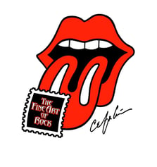
Ernie Cefalu made a name for himself designing album covers. As co-founder of the agency Pacific Eye & Ear, he created over 200 album covers for rock bands during the 1970s and 80s. He is one of the designers behind The Rolling Stones’ lips and tongue logo, and his work has been recognized with three Grammy nominations and ten Music Hall of Fame Awards.
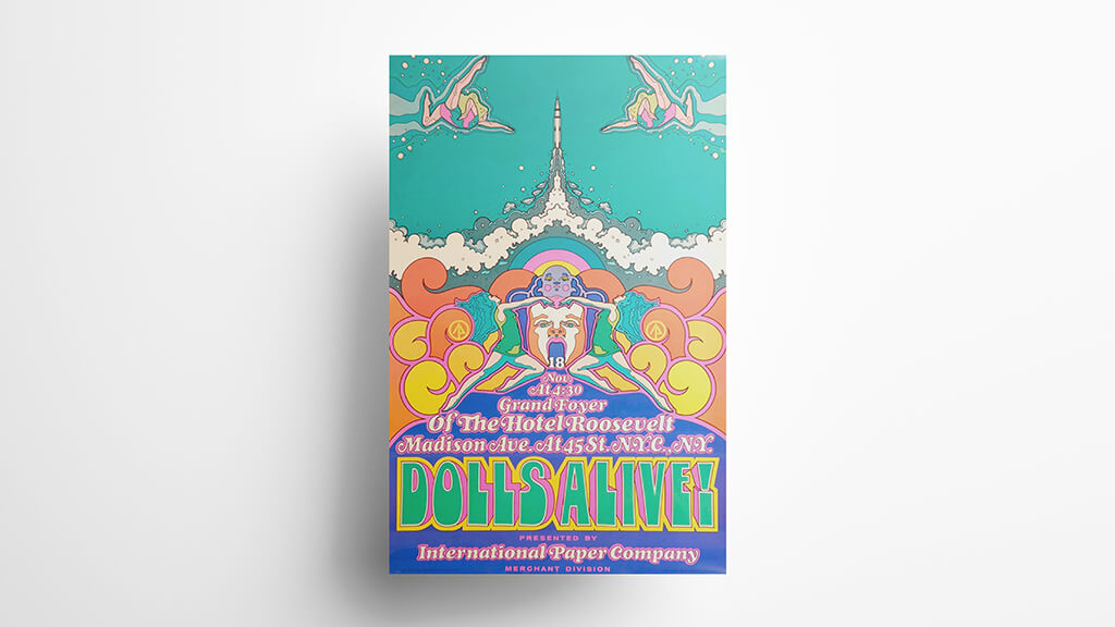
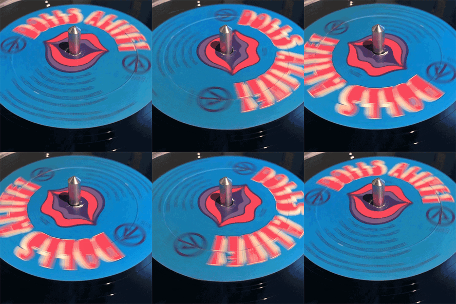
 But before all that, he was a young designer working at an agency, tasked with creating a campaign for Sylvamo's 1970 national sales meeting. He skipped the traditional mailer and instead created an original off-Broadway musical production: Dolls Alive! The show’s score was recorded as an album, and each attendee at the sales meeting received one as a takeaway reminder of Sylvamo's latest products. As part of the project, Cefalu designed a limited-edition hexagonal album cover that is now coveted by album collectors.
We caught up with Cefalu to hear about that project, his subsequent design work, and what he’s up to next.
You and Sylvamo go way back. What’s the story there?
I was just thinking about the Dolls Alive! piece that we did for Sylvamo in the beginning of my career because it was so influential in my creating the Rolling Stones logo, and ultimately having my career change from corporate America and Madison Avenue to doing album covers. That was a complete left turn for me, and Sylvamo was part of that.
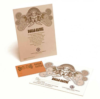 The project came about when I was working for Carolini and Associates, a small design agency in lower Manhattan. I guess it was the biggest project they’d gotten all year, and they needed somebody that had a fresh new kind of look. I had just come from growing up in California and going to college in Oakland, and I was part of that whole Berkeley revolution that was going on in the 60s — I was right in the heart of it. Most of the kids that went to school with me at Arts and Crafts [now California College of the Arts] lived in communes in Haight Ashbury.
There was a lot of change going on, not only socially but in design — especially the design of album covers. Up until the late 60s, most album covers were paper-wrapped packages, which meant it was a chipboard sleeve wrapped in two pieces of paper, one on the front and one on the back. One of the first album covers to be done on board directly was the Lou Reed/Velvet Underground package with the banana on it. It had a sticker that was a yellow banana, and you could take it off and put it on, take it off and put it on. Well, that was the first custom album package. It was interactive and it was on board, not a paper-wrapped package. There are certain things you just can’t do with paper-wrapped packages because of the tolerances — you couldn’t do embossing, you couldn’t do die-cutting, you couldn’t do anything like that sticker.
It was actually two years before that that I created the Dolls Alive! album cover for Sylvamo, which needed to be on board and couldn’t be a wrapped package because of its hexagon shape. The Sylvamo sales rep worked closely with me on the stock. I chose a 22-point coated board for the cover. And that stock later became very important to me, because, shortly after that, I went from doing corporate America work to doing album covers.

When I did the Stones logo, I was dealing with Ivy Hill, a big printer in Terra Haute, Long Island and Los Angeles, and when we worked on the Sticky Fingers album with the zipper, we had Ivy Hill make sure it was Sylvamo. I only wanted to use that stock, and I went on to use it often for the album covers I created.
 And the album cover you created for Sylvamo was the first of hundreds of album covers you would go on to design.
Yeah, it’s funny. In college, a lot of us would go down to Haight Ashbury and sit in front of the Jefferson Airplane house there, and three or four years later, I’m doing work with Jefferson Airplane.
And The Doors, Aerosmith, The Bee Gees — what was it like to work collaboratively with so many iconic bands?
At the same time that there was this change, paper-wrapped packages to board packages, the music was changing from the East Coast to the West Coast, San Francisco and Los Angeles.
A lot of these record companies wanted to sign groups to their labels, so they were giving the musicians more creative control. The bands would determine where they were going to record the album, who was going to produce it, where it was going to be printed, and who was going to do the album cover design.
It was the first time that musicians were dealing directly with people like me. Up until then, the record company would pretty much exclude them, maybe take a picture of them or something, and that would be about it until they saw the printed piece. At Pacific Eye & Ear, we had these bands coming to us because they wanted something they could be happy with. And we would do board packaging and use Ivy Hill.
Looking back at the album covers, that newfound freedom and the evolution of music and design at the same time is so evident.
When we were dealing with records and album covers, it was all about the band. And the crazier we got with what we could do for them, the better they loved it — unlike corporate America, which was scared to death of us.
But you’ve continued to take on some corporate work over the years.
I’ve always felt that the fuel for creativity is variety, so I never wanted to get pigeonholed doing any one thing — which would have been easy, especially in the record business. I’ve always sought out corporate work. We have freedom with the rock bands and are more restricted with the corporate clients, so you have that nice balance. It keeps it really challenging.
I never imagined that I would design album covers. I always liked music, but I went to New York from the West Coast to work on Madison Avenue, because I thought that’s what you wanted to be: a creative director at an agency on Madison Avenue, working on corporate business. So I was on Madison Avenue, working in agencies, when these album cover projects came along, and that’s when everything changed for me.
The first album cover I ever did was Dolls Alive! At the time, corporate America was still afraid of using music like that. In the 60s and 70s, even into the 80s, that era of music was not selling anything but records. There weren’t corporate clients like there are today. I just saw a commercial for milk where they’re using a Sam Cooke song from like 1958. In those days, they liked the attitude that we brought, but they were afraid of the music. Today, music sells everything.
Out of all the album covers you designed, which are your favorites?
Jesus Christ Superstar. And then the Rolling Stones tongue.
(That’s a whole other story, and it got really political. I was introduced to Marshall Chess, the guy who was managing the Stones. Mick Jagger and those guys really didn’t like Marshall. His dad owned Chess Records and sold it to Atlantic. They made his dad president, and he put his son in charge of managing the Stones. They didn’t really like him, so they took what I had done and gave it to a guy named John Pasche in England, who did a version of it. So, right from the beginning, there were two versions. Mine was used on all the merchandise and marketing stuff, and his was used on the record cover, on the back and on the sleeve.)

And then there was Cheech & Chong’s Big Bambú, which was nominated for two Grammys. Always a bridesmaid, never a bride. But still, being nominated was really a great honor.
 This is really like asking which one of your children do you love the best. I love them all, but those were the bigger ones in the beginning. We did a Grand Funk album cover that was foil mounted to board and embossed to look like a big coin. We did a Doors album that was a zoetrope. It had two extra panels that you took out to create the zoetrope, with a little pedestal that sat on top of the record, and as you listened to the music, you could see the animation through the slits. It was called Full Circle. Unfortunately, it was the second album after Jim Morrison passed away, and once he was gone, the music was really lacking. But I think it was one of the most creative covers that we did. Again, it had to be on board, and Ivy Hill printed it. Obviously, Ivy Hill was using Sylvamo already, but they knew that every cover that I did that went through their facilities would be on that 22-point coated board.
It’s funny, I had no idea when I did Dolls Alive! that Sylvamo would play such an important role in everything else I did, even to this day.
It’s wild that a single stock has played such a crucial role for you at a macro level. In general, what is the role of paper in your day-to-day practice?
I still do everything old school. I still work with rough sketches because I’m able to do it faster. Most people today do it on a computer. You hire a design agency to give you concepts, and they’ll spend hours on computers. Maybe they create five concepts and it takes them two days, but you’re only buying one. I can do five or ten sketches in a few hours, tight enough to show the client the concept, and then I tighten it up from there. By the time it gets to the computer, it’s just one chosen concept.
I’ve done video, I’ve done radio, I’ve done television. My main thing has always been paper. I’m a print guy, so paper has always played a big role in what I do. It’s where the ideas start.
What other tools are critical to your craft or your creative process?
I’m a pretty simple guy. I work with a black ballpoint pen from Kinko’s. It has the perfect ink. It doesn’t smear. But they don’t sell them. They have them there for people to use, so every time I go in there, I usually liberate a dozen or so.
I’ve tried everything. I’ve tried pencils, can’t do that. I can’t work with felt markers. It’s the ballpoint pen, and a piece of 8.5x11 paper. I don’t work bigger than that because that’s how big my scanner is.
I usually listen to music. Sometimes I just sit at the desk and doodle and sketch and think about the ideas. Whether it’s a logo or a graphic idea or a concept for a photoshoot, I think about the project and what we want to try to convey. It’s basic and boring, but that’s how I work. Sometimes I’ll wake up in the middle of the night and write down ideas on the pad beside my bed.
People will say, “I created this and I did it all by myself.” Those people are lying, because creativity is a process. It means interacting with nature, interacting with an animal, interacting with other people. We never work in a vacuum. The world is such an incredible axis of concepts and ideas, you just have to plug into it.
What advice do you have for emerging designers?
It’s all about the idea. You can be the best illustrator in the world, but if the idea is weak, you can just hang it on your wall and forget about trying to sell a product. It has to have meaning, and it has to deliver the message correctly.
The other thing I would tell young people is to make sure you take some legal classes and some business classes. I went to Arts and Crafts, a highly accredited art school, but they never taught us anything about the real world, and there are people out there who will take advantage of you. Every client has value that they bring — they know their product better than you do. But understand the value that you bring, which is that you can make their product come alive.
 So, what’s next for you?
This is my fiftieth year doing this. People say, “When are you going to retire?” Well, when the phone stops ringing. The Internet has actually caused a major resurgence for me. I go to these sites and read the comments about my work, and after reading six or eight comments, I’m crying like a baby. It’s humbling to hear how people relate to it and how you’ve touched people’s lives. I love what I do; I’ve always loved art. For me, there was never anything else I could have done. In life, we all try to do things that make this place better or that leave a mark. I feel like I’ve done that. As long as people have ears and eyes, what I’ve done will live on.
Thanks to Ernie Cefalu for taking the time to chat with us! See his gallery of original album cover art here. Limited edition images are the exclusive property of, owned by, and used here with permission from Pacific Eye & Ear.


